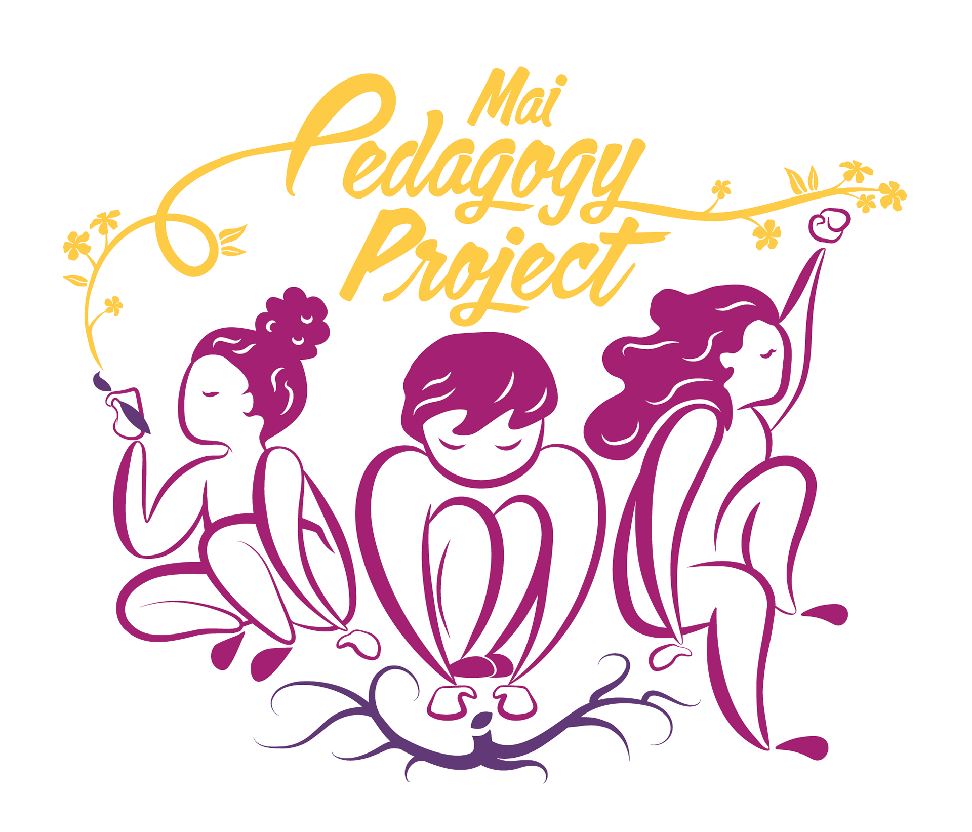
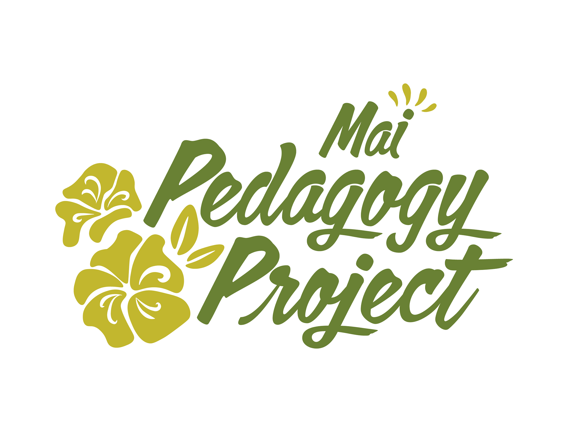
This logo was designed to represent the research artivism work of Josephine Pham and various scholars, artists, educators, activists, and more; Mai Pedagogy Project aims to illuminate the historicized, social, cultural, political, relational, spiritual, and embodied nature of pedagogical practices for liberatory education.
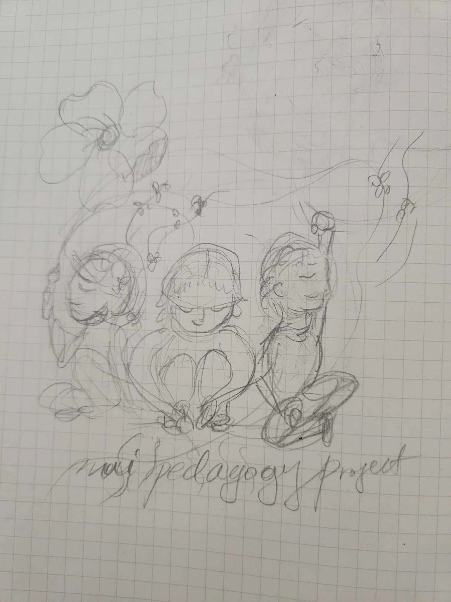
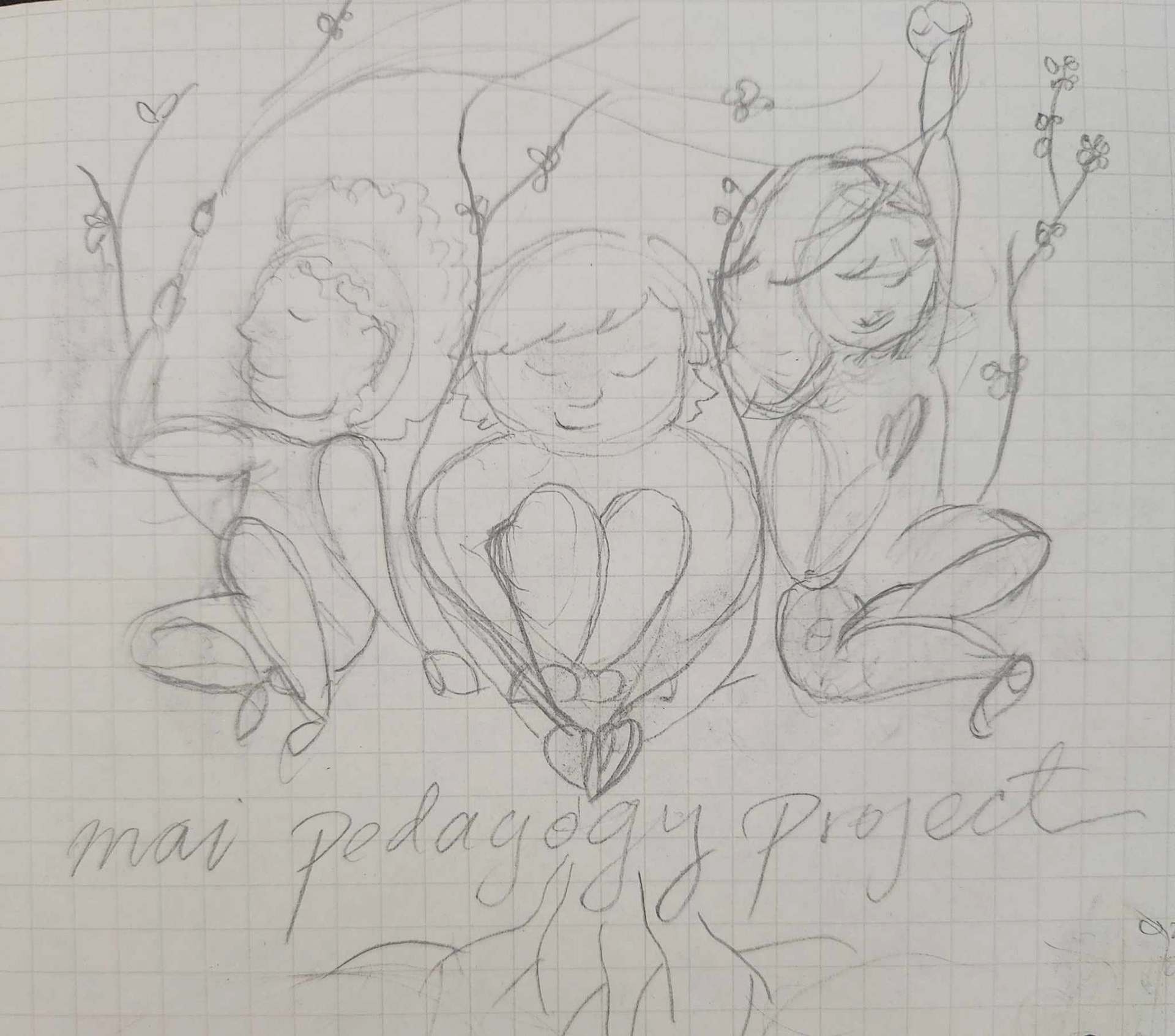
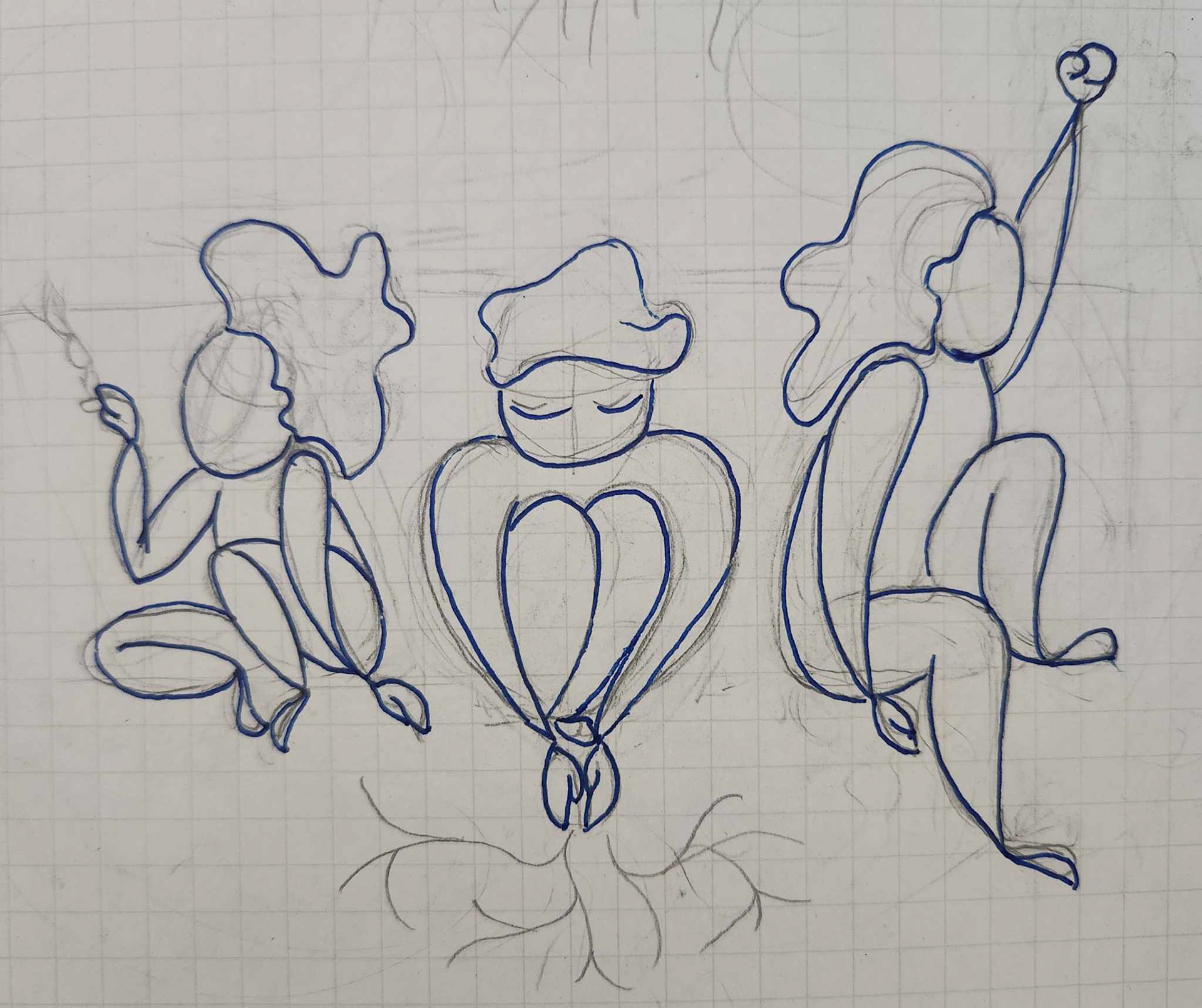
I started with some pencil sketches and initial color mockups.

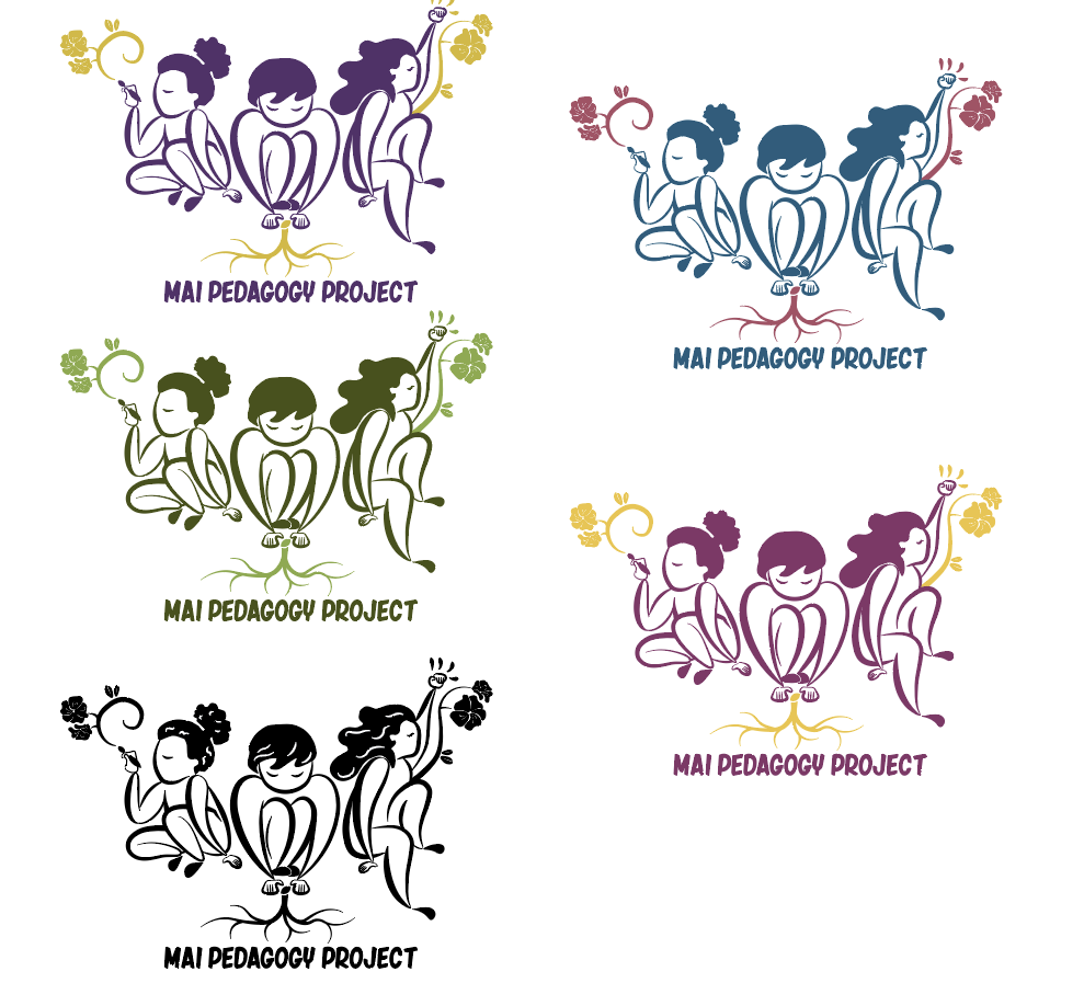
We eventually landed on this earth-toned color scheme, but felt that it wasn't quite right and moved towards a raspberry color scheme instead.

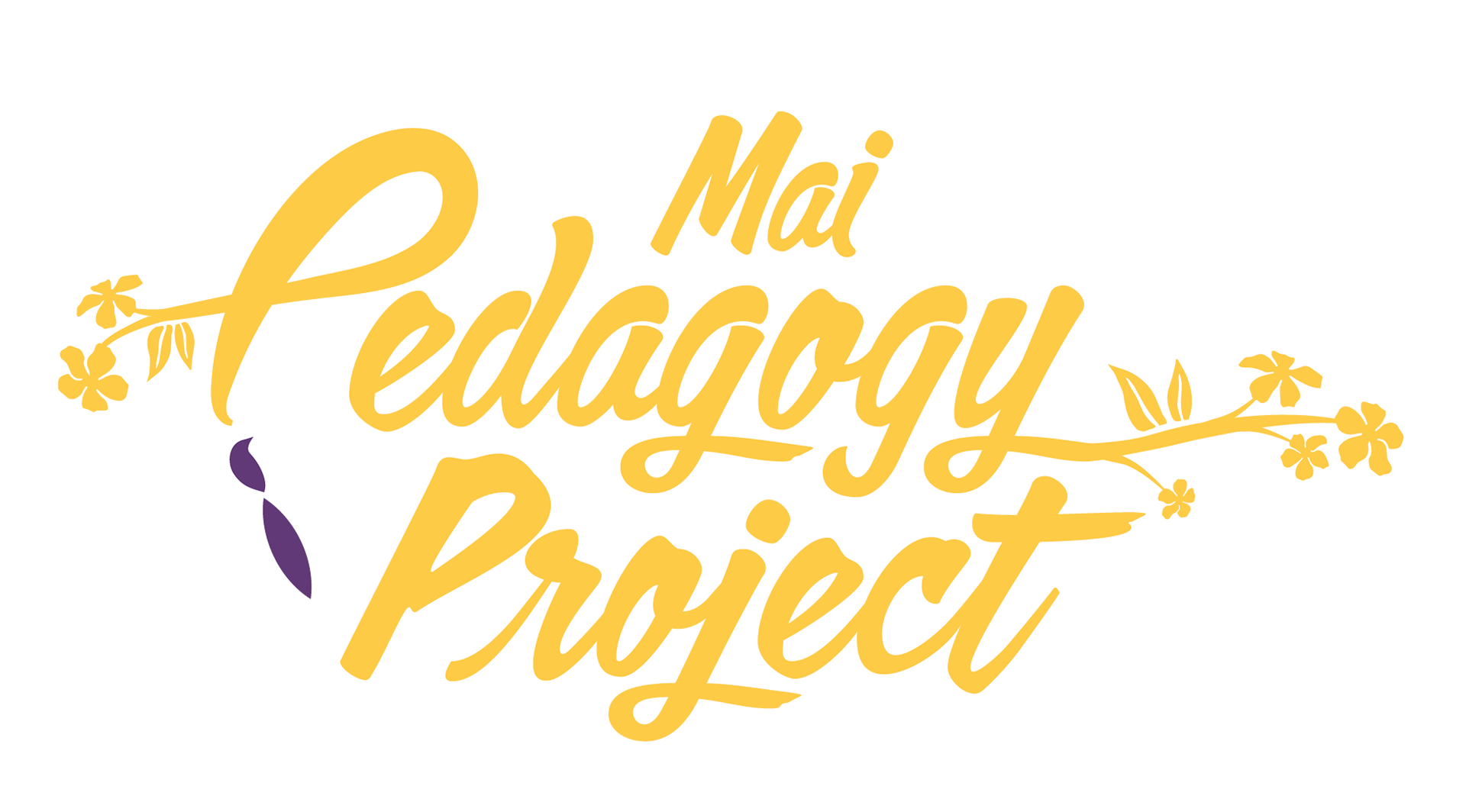
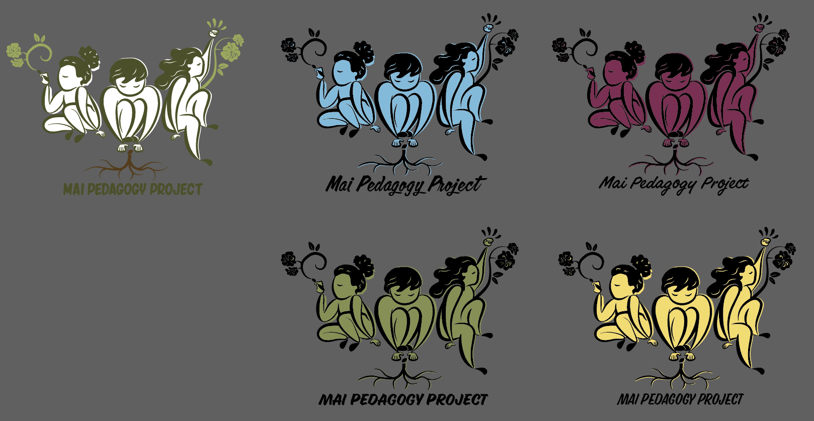
While we liked this new color scheme, we felt that this lockup read as "tropical" or "Hawaiian" due to the size of the flowers (which looked more like hibiscus flowers). I decided to rework parts of the illustration so that the text would be above the illustration and redesign the flowers to look more like apricot blossoms instead of hibiscus.

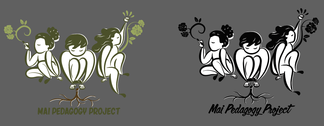
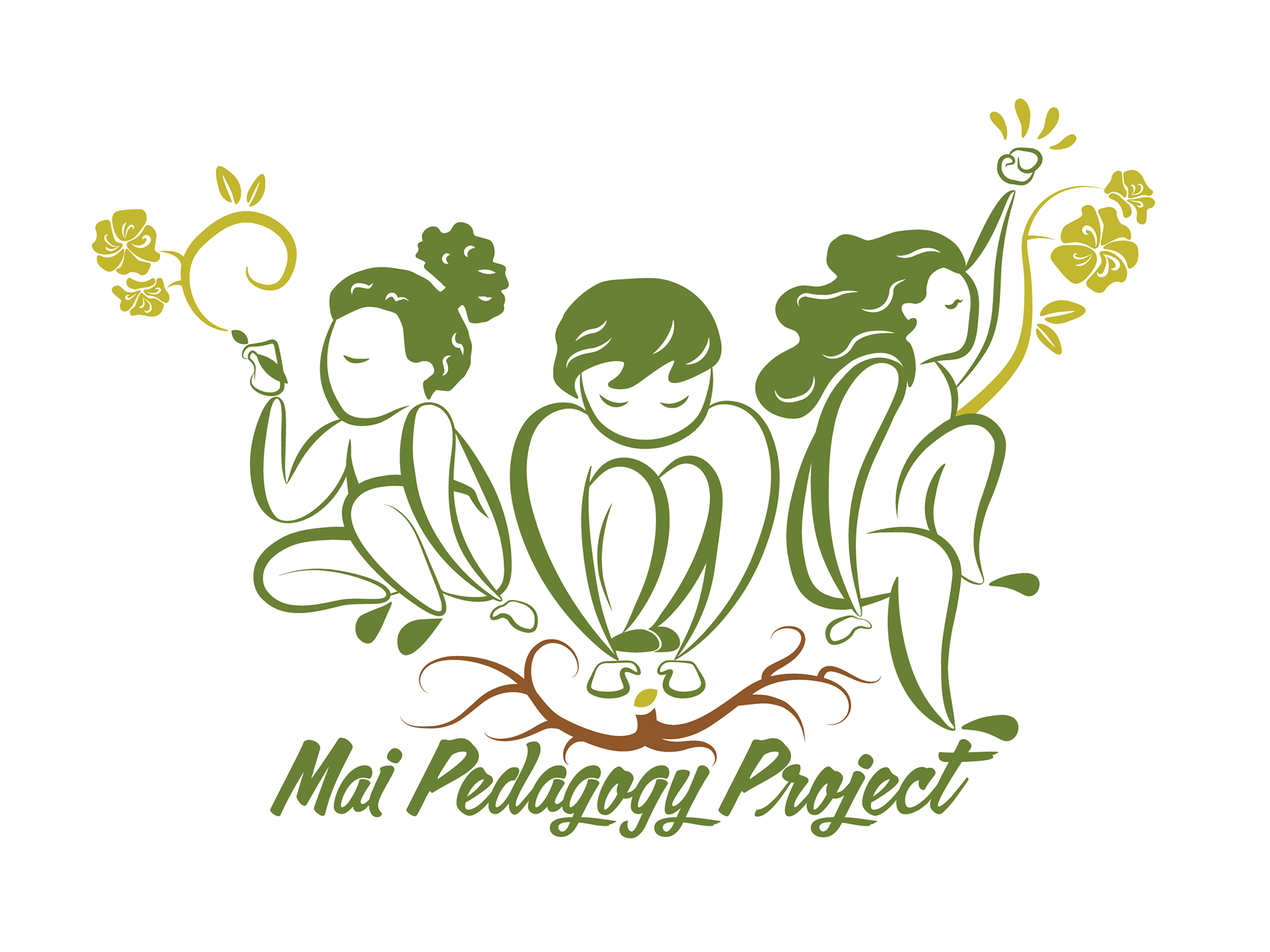
These are the final lockups in both color and black and white. The logo features three figures: one who is painting, one who is planting seeds, and one with a fist of power. They are facing back-to-back as a show of collective solidarity and community care: we do this work together and have each other’s backs. The logo also features yellow apricot blossoms (also known as hoa mai in Vietnamese, a symbol of renewal/life/good fortune). The roots represent indigenous and community-grounded wisdom to move at a pace that is both anti-capitalist and deeply grounded.